It's true - I love signs. I take pictures of them, laugh about them and talk about if they work or not. I think the fascination is related to explanations. Signs are usually meant to communicate within constraints, much like our videos. This post is the first in what I plan to make a series. Let's look at a few.
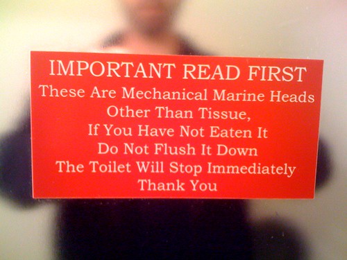
This sign is at an establishment on a boat dock in Seattle. Like any "head" or toilet on water, it deserves special care because it doesn't operate like a normal toilet. Overall, I think it's great - it provides a simple, understandable rule and a concrete consequence for not following it. But I can't help but get stuck on the opening line "These are Mechanical Marine Heads." Why is it so specific? Does this mean anything to the land-lubber? I doubt it does and I think it compromises the communication by using language that's overly specific. The opening line is so important and it should inspire confidence. This one made me say "so?" I suggest "This toilet is different."

Please forgive the focus on the bathroom, but they are often filled with interesting signs. This one is at SeaTac airport, but is one you see everywhere. My criticism of this is not about content so much as placement. If the goal is to get people to wash their hands, why tell them at the sink? If they're at the sink, there is a good chance they're already doing it. I think the sign should be placed near the toilets.

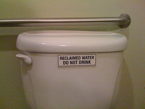
Speaking of toilets, this sign is on a toilet at a restaurant in Seattle. The toilets use reclaimed water, which is an environmentally friendly option and one that humans can't drink. The sign has to be there by law. It's obviously clear and effective, but seems kind of ridiculous and even funny. On the sign by the urninal, there's a hand written note that says "OK, I will not drink from the toilet. Thanks."

Next I promise to move away from the toilet-focused signage.