We've re-thought our website from the ground up and soon you'll see the all the changes we're making. For now though, I want to highlight a few things that make a big difference.
1. A Focus on the Business. This may be the best way to explain how the focus has changed:
- The current Common Craft site says "WE HAVE A BLOG - and we sell videos"
- The *new* Common Craft site says "WE SELL VIDEOS - and we have a blog"
It's true - the new site is more closely aligned with the goal of finding, viewing, purchasing and downloading videos.
2. Simplified Video Organization. Our videos used to appear in two places, depending on their version: "free" or "presentation quality." We've consolidated the display of videos one a single page. This means:
- No More "Common Craft Store" - Instead of trying to attach a video store to the site, we're integrating the purchase experience into the pages where the videos appear.
- No More "Common Craft Show"- The "Common Craft Show" was simply a way to organize the free versions of our videos. Now higher-quality versions of the videos will appear in a single place on the site.
3. Videos in 5 Languages
We're taking a big step to internationalize our videos. For the first time, 10 of our videos (including the Social Media 9 Pack) will be available with voice-overs in 5 languages (English, French, German, [Brazilian] Portuguese and Spanish.) These videos will be available for viewing, purchase and download.

4. Organization by Major Topics
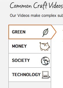
Our video library will be organized into four major topics, which outline our direction in the future. The topics are: Green, Money, Society and Technology.

5. Overall Look and Feel
Our goal was to make the site look and feel like our videos. We've integrated our artwork, used a white background and tried to make the experience as focused as our videos.
Of course there are many more changes, but I think these points capture some of the big ideas that drive the new design. More soon...